Get the Best Results from PhotoLister
These photo patterns work reliably across large batches.
You don’t need perfect photos, just consistent ones.
This guide shows what works well and what can cause issues, using realistic examples from everyday product listings.
⏱ Takes about 30 seconds to skim
Backgrounds & Contrast
Clean, simple backgrounds make the biggest difference.
PhotoLister isolates your product before applying studio lighting, shadows, and formatting. When the background blends into the item, through similar colors, textures, or shadows, it becomes harder to separate the product cleanly and consistently across a batch.
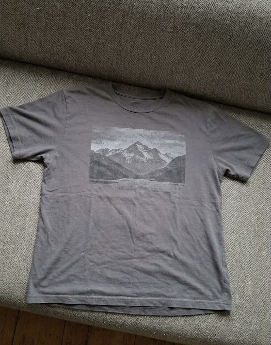
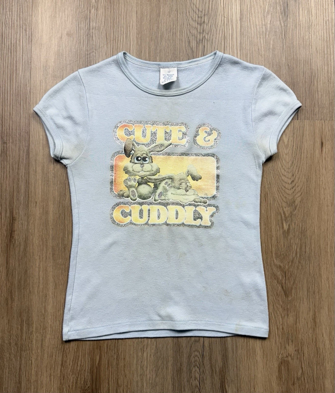
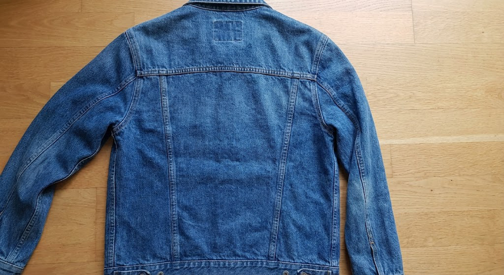
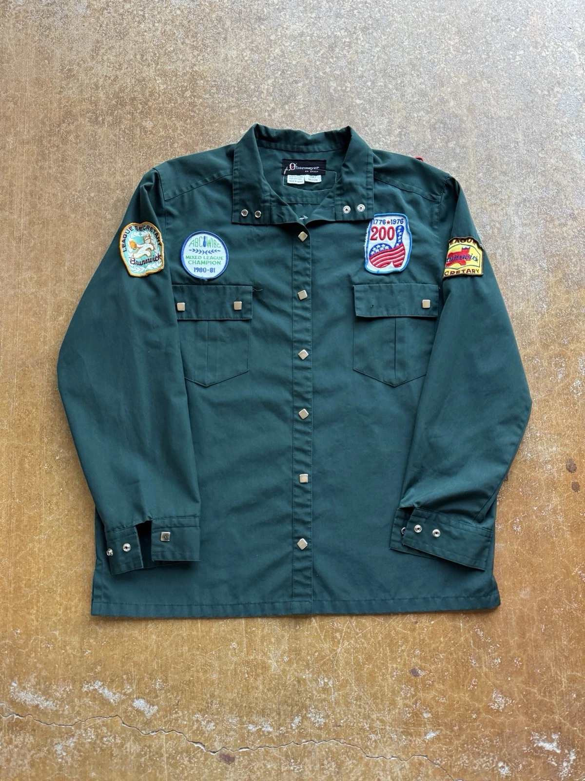
✅ Good example
- Plain, low-texture background with clear contrast
- Solid wall, floor, or backdrop
- Noticeable contrast between the item and background
- Minimal visual detail near edges
This gives PhotoLister a clear silhouette to work with, resulting in sharper edges and more predictable output.
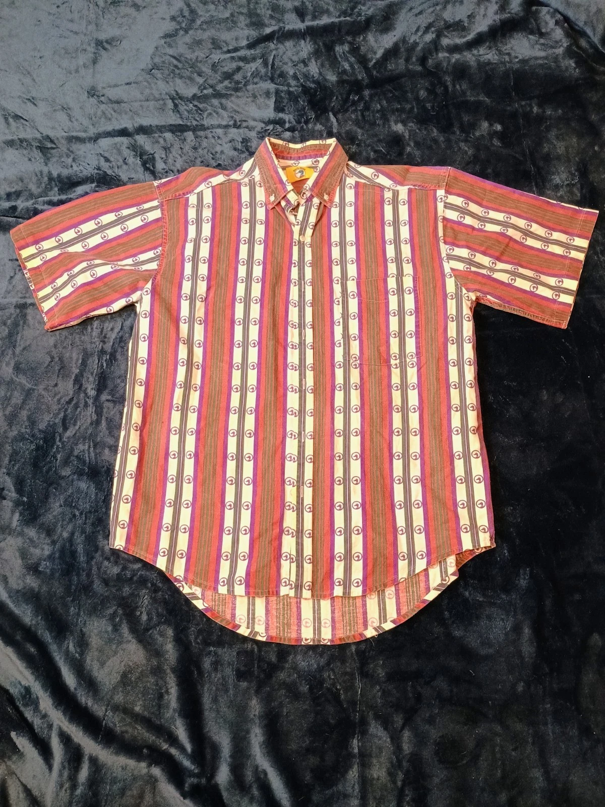
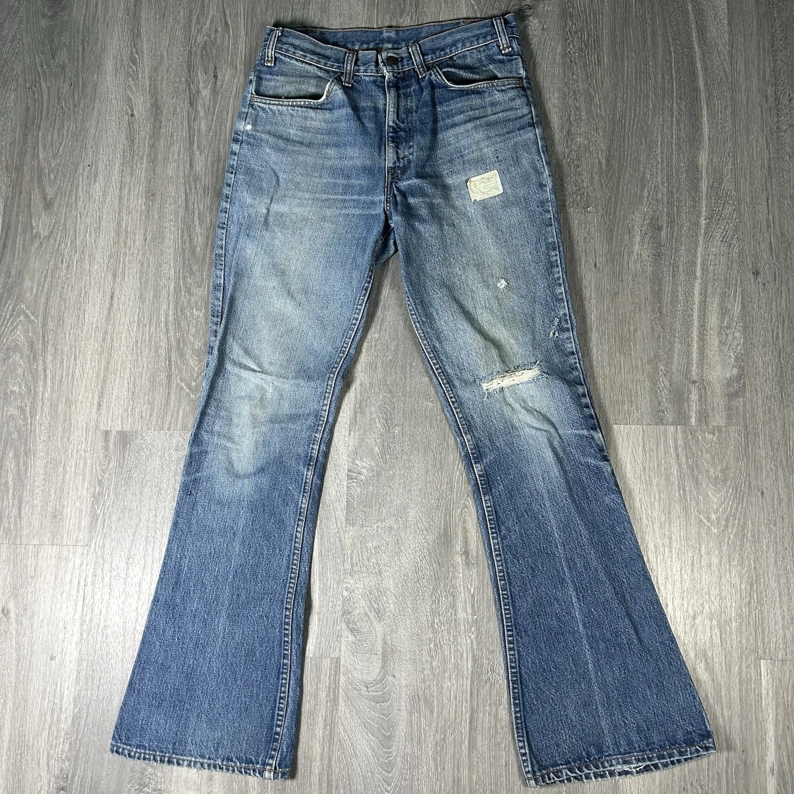
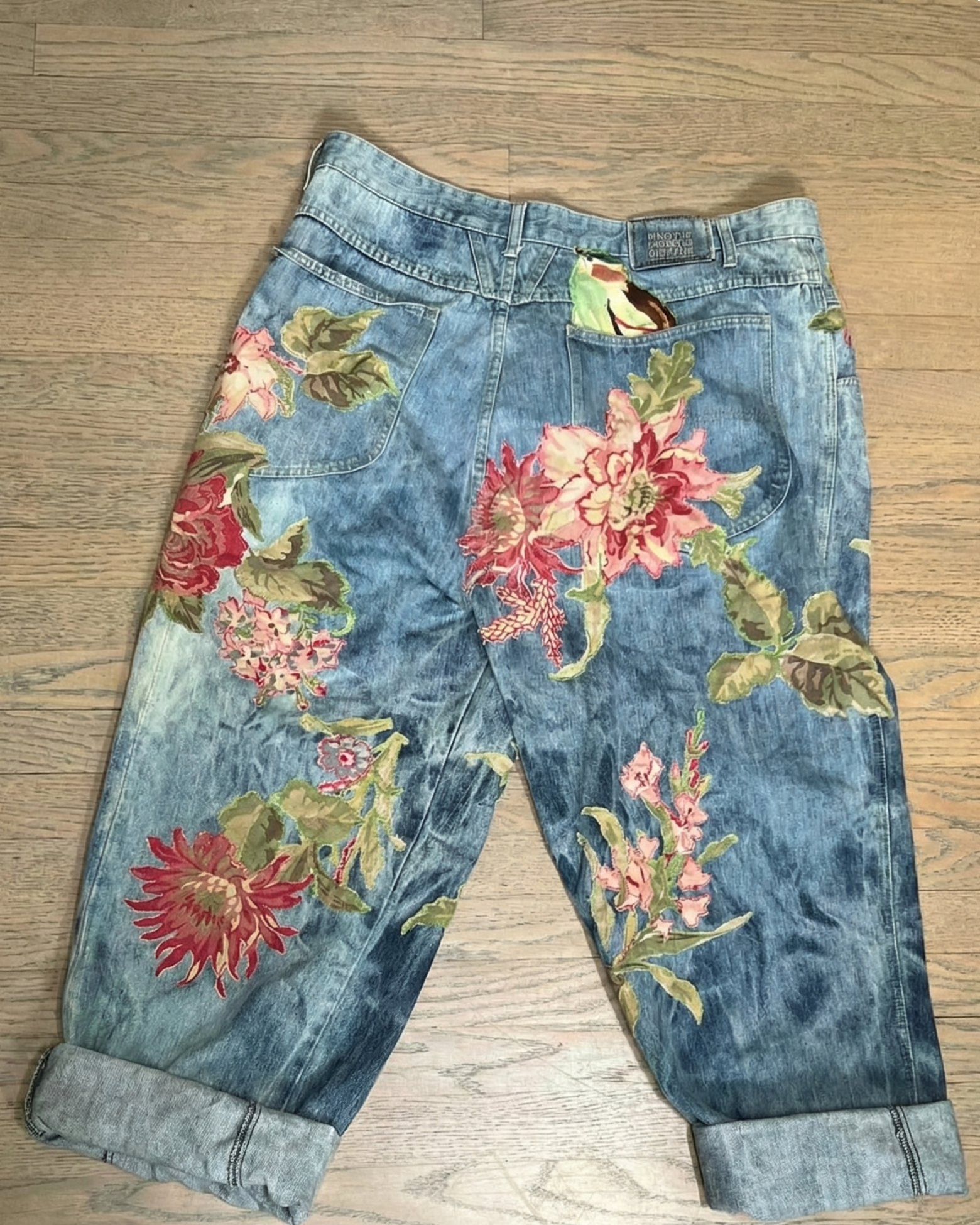
❌ Problematic example
- Textured or low-contrast background
- Similar colors between item and background
- Textured surfaces (bedsheets, rugs, wood grain)
- Patterns or objects touching the edges of the item
These backgrounds can blend into the product, leading to uneven edges or less consistent results, especially when processing larger batches.
Tip: If your product wouldn’t clearly stand out in grayscale, consider a simpler background.
Framing & Crop
Keep the entire product clearly visible in the frame.
PhotoLister works best when it can see the full shape of the item without guessing where edges begin or end.
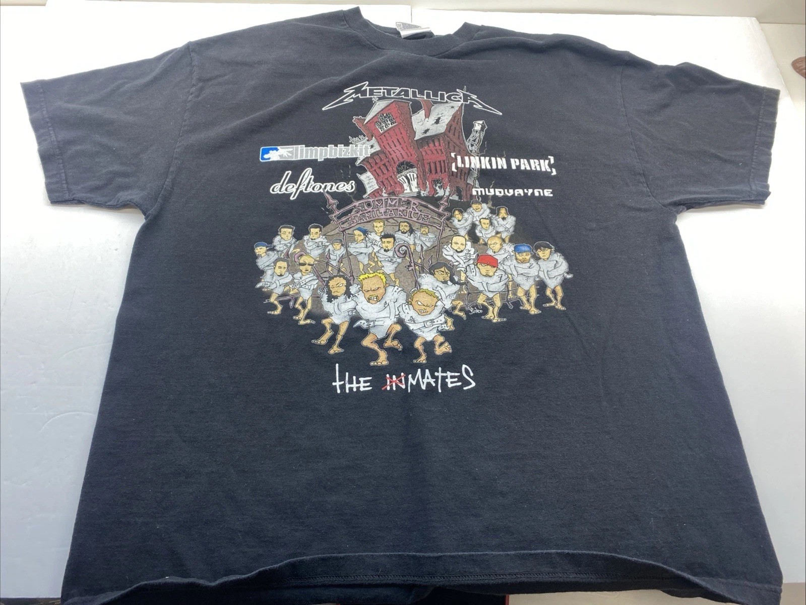
✅ Good example
- Product fully in frame
- All edges visible
- No tight cropping at sleeves, hems, or collars
- Comfortable spacing around the item
This allows PhotoLister to center and normalize framing consistently across the batch.
❌ Problematic example
- Tight or awkward crop
- Parts of the item cut off
- Edges pressed against the frame
- Uneven spacing around the product
These can cause inconsistent framing or unexpected cropping in the final result.
Orientation & Alignment
Straight, upright photos produce more uniform results.
✅ Good example
- Level and upright
- Item aligned vertically
- Camera parallel to the surface or wall
- No noticeable tilt
This helps PhotoLister standardize orientation across all images.
❌ Problematic example
- Tilted or angled
- Item leaning or rotated
- Camera angled off-axis
- Even small tilts can introduce inconsistencies when processing many images together
Lighting Quality
Even, natural lighting works best.
PhotoLister doesn’t require studio lighting, but it benefits from lighting that’s consistent and not overly dramatic.
✅ Good example
- Soft, even lighting
- Diffuse natural light
- Minimal harsh shadows
- One dominant light source
This keeps edges clean and colors stable.
❌ Problematic example
- Harsh or mixed lighting
- Strong directional shadows
- Multiple light sources with different color temperatures
- Hot spots or deep shadow pockets
These can introduce noise around edges and reduce output consistency.
Common Real-World Issues
These are very normal, but worth watching out for.
❌ Examples that may need review
- Wrinkles or heavy folds creating false edges
- Hangers partially visible
- Background objects overlapping the product
- Fabric blending into cushions, pillows, or furniture
PhotoLister will still process these images, but results may be less predictable across the batch.
Designed for Large Batches
PhotoLister is built for consistency at scale.
You don’t need perfect photos.
You do want photos that follow the same basic patterns across your entire batch.
The more consistent your photos are, the better PhotoLister can standardize lighting, shadows, and framing across all images.
Ready to Upload?
If your photos look similar to the “good” examples above, you’re set.